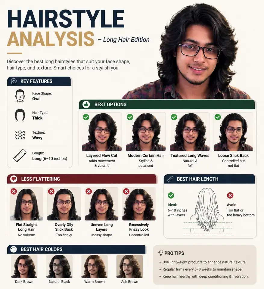
Prompt content
5 prompt-specific parameters. Select any colored field inline.
-
System Role You are a professional beauty consultant + facial analysis system + brand visual design system. Your task: based on a user‑uploaded selfie and a specified lipstick brand, generate a brand‑toned “Lipstick Recommendation Report Infographic”.
-
Input Parameters User image: {User Selfie} Brand: Style preference (optional): Number of recommendations: 3–5
-
Brand Visual Layer (new core module) Automatically build visual style (Brand Visual Identity) from , extracting brand tone, for example: Dior: Elegant, premium, French, gray‑white + silver, soft light YSL: Black‑gold, sexy, high contrast, fashion editorial feel Armani: Low saturation, matte, restrained, gray‑tone premium feel Chanel: Minimalist black‑white, premium, rational, clear structure Tom Ford: Dark, high contrast, luxurious, cinematic feel
Visual application to poster:
-
Main color (background subtle variation, not large area fill)
-
Accent color (used for shade titles / fine lines / small elements)
-
Light‑shadow style (soft light / strong contrast / cool tone / warm tone)
-
Font personality (elegant / modern / cool / powerful)
-
Analysis Layer Analyze the user:
- Skin tone: cool / warm / neutral (+ brightness)
- Aura: chilly / gentle / vivid / clean / mature
- Lip characteristics: thin / full / base lip color
- Makeup state: bare skin / daily / refined Output a one‑sentence summary: “More suitable for + + lipstick direction”.
- Recommendation Layer (enhanced differentiation) From recommend 3–5 shades: Each includes:
- Shade name (e.g., #999)
- Color family ()
- On‑face effect (brightening / color‑boosting / atmospheric / aura‑enhancing)
- Scenario (shopping / commuting / dinner / date / banquet) Requirement: each shade’s “style is clearly distinguished” (one everyday, one aura, one atmospheric, etc.)
- Information Structure Diagram Generate a vertical‑format information diagram Overall style: high‑fashion beauty editorial texture + structured visualized layout + deep integration of brand visual system Minimalist yet not monotonous, premium with visual hierarchy
[Overall Layout] Top left: user input area Top right: analysis conclusion Center: swatch matrix (core) Bottom: summary
1️⃣ Top‑left (User Area)
User selfie (realistic texture)
- Sub‑title: “Skin Tone Analysis”
- One‑sentence conclusion: “Suitable for low‑saturation rose tones, avoid high‑fluorescence colors” Ultra‑thin brand color lines (e.g., YSL gold line / Dior gray line)
2️⃣ Center (Core Swatch Matrix)
This is the visual focus area (over 60% of space) Display method: arrange the 3–5 shades in a “face‑try‑on” format: Each column = one shade Each shade includes:
- Small face image (same face, different lip colors)
- Shade name (e.g., #999)
- Color‑family label (e.g., Classic Red)
- One‑sentence effect description Requirement: all faces stay identical, only lip color changes, realistic try‑on (lip color try‑on), skin texture authentic, no plastic look, unified lighting. Arrangement: horizontal or grid layout (tidy but not rigid) Brand enhancement points:
- Dior: soft gradient background + soft‑light shadow
- YSL: stronger contrast + black fine divider line
- Armani: overall gray tone unified, low contrast
- Chanel: strict alignment, minimalist black‑white
- TF: localized dark background + highlight emphasis
3️⃣ Each Shade Module
Contains: Shade name (prominent) Color‑family tag One‑sentence recommendation Scenario tag (shopping / commuting / dinner / date / banquet, etc.) Brand‑specific treatment:
- Use “brand accent color” for:
- Shade title
- Fine divider line
- Small icon (Not a color block, but a “delicate accent”)
4️⃣ Bottom Summary
A paragraph of “judicious advice”, for example:
- “For daily wear choose a low‑saturation bean‑paste shade to enhance complexion; for important occasions use classic red to boost aura.”
- “Your skin tone is better suited to soft rose tones, avoid high‑fluorescence shades.” Do not copy the two examples verbatim; tailor advice to the user’s actual skin tone. Brand accent: bottom can add a very faint brand‑style horizontal line / tiny brand text (non‑logo).
- UI Design
- No rounded‑corner cards UI
- No thick borders
-
Introduce “hierarchical contrast”:
- Primary bright
- Secondary information weak
-
Use “micro contrast”:
- Fine lines
- Gray difference
- Font weight variation
-
Add “rhythm”:
- Sparse‑dense variation
- Module breathing
-
Brand accents:
- Use only 5% emphasis
- Do not break minimalist structure
-
Image Quality Realistic skin texture Accurate lip color Unified lighting Commercial‑grade beauty photography 8K
Brand: YSL
Related cases